Loitering, Legibility; Disability, Design
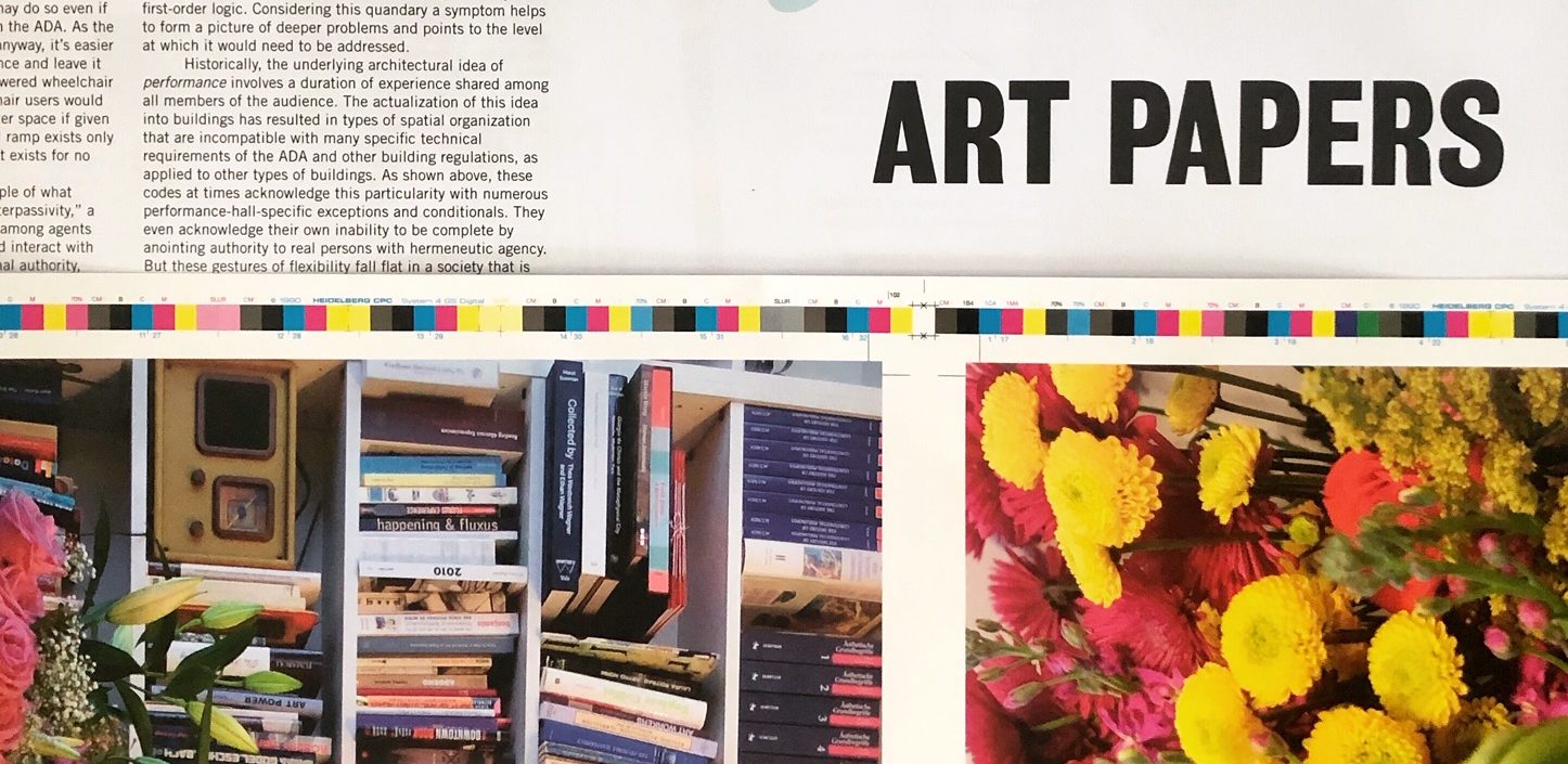
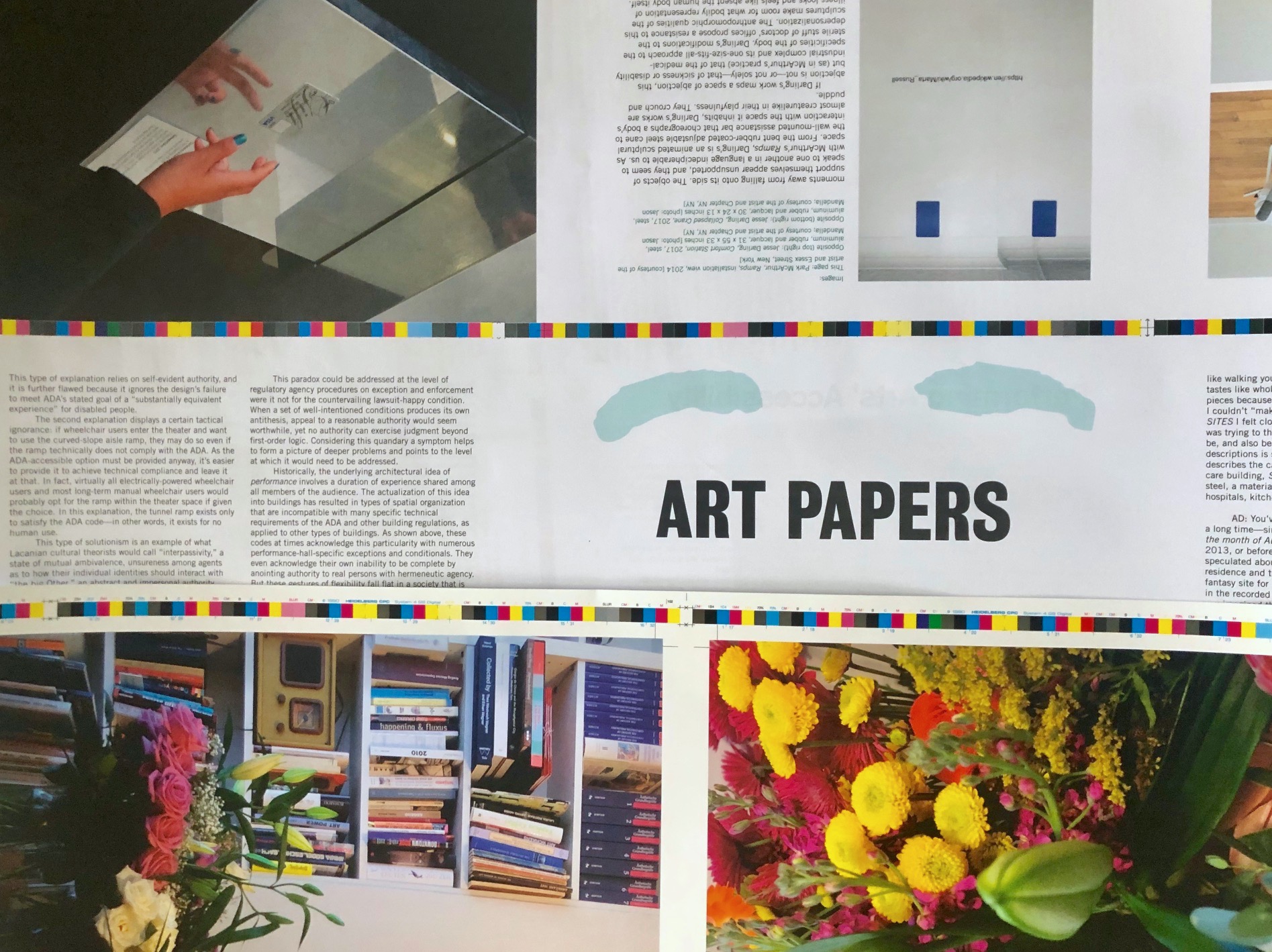
ART PAPERS "Disability and The Politics of Visibility" guest editor Emily Watlington spoke with guest designer Gabriel Cira about accessible design for opposing needs, truncated domes, and how little things can go a long way.
Share:
Emily Watlington: Designing for disability is never a singular, stable thing. At least, that’s the conclusion we came to in Fall 2018 in the class we taught together at MIT, “Architectural Access: Code and Care,” with the help of our students and guests. There are so many disabilities and so many bodies and minds with different access needs, but also different preferences and personalities.
Sometimes these needs intersect, but sometimes they conflict. This is true of, say, the history of curb cuts meant to provide sidewalk access to wheelchair users. Later, these had to be textured with truncated domes so that blind and low-vision people who walk with canes could know they were walking into the street. How did the multiplicity of disabilities and their aligned or opposing needs inform your design and thinking on the issue?
Gabriel Cira: One of the current mantras of Universal Design goes something like “Universal Design just means good design.” I think that this mentality risks generating a singular aesthetics of accessibility that also, paradoxically, has no author. Taking truncated domes as an example: they are almost always bright yellow. The argument goes that this helps low vision people since it’s an unmissable color. So, bright colors, red and yellow, are frequently used, even though there’s a thousand different ways to achieve high contrast, depending on the environment, the lighting, and many other choices.
This kind of thinking—and designing—risks reducing the aesthetics of accessibility to standardized marking or labeling, represented here by the idea that the standard bright yellow is recognizable as a marker of the curb-cut bottom by virtue of the fact that it is the standard. I think we should avoid uncritical use of the conventions of disability aesthetics because they obscure intention and risk obscuring utility.
EW: Yes, but of course standards are useful for enforcing accessibility standards, too.
I see a parallel between what you’re saying and something Georgina Kleege says in her book “More than Meets the Eye: What Blindness Brings to Art.” She talks, for instance, about programs for blind and low-vision people in art museums that assume the audience has zero training in art history. Both of her parents were artists, and she knows a lot about art! Without wanting to undermine the regulations that hold people accountable, designing for disability should resist norms and standards that make assumptions and ignore the diversity of embodiments.
GC: For this issue of ART PAPERS, I made some basic considerations for usability and legibility, choices on layout and flow so that each page would be kind on the eyes and so that the magazine as an object would be easy to hold and read. We chose paper types and a binding method so that the magazine wouldn’t snap shut, but also so that it wouldn’t feel too glossy or precious. In terms of graphical legibility, there are some more subtle text highlights for the interviews that make each voice more distinct. These are simple shared graphic tendencies; they are not unpredictable, but they are also not inflexible.
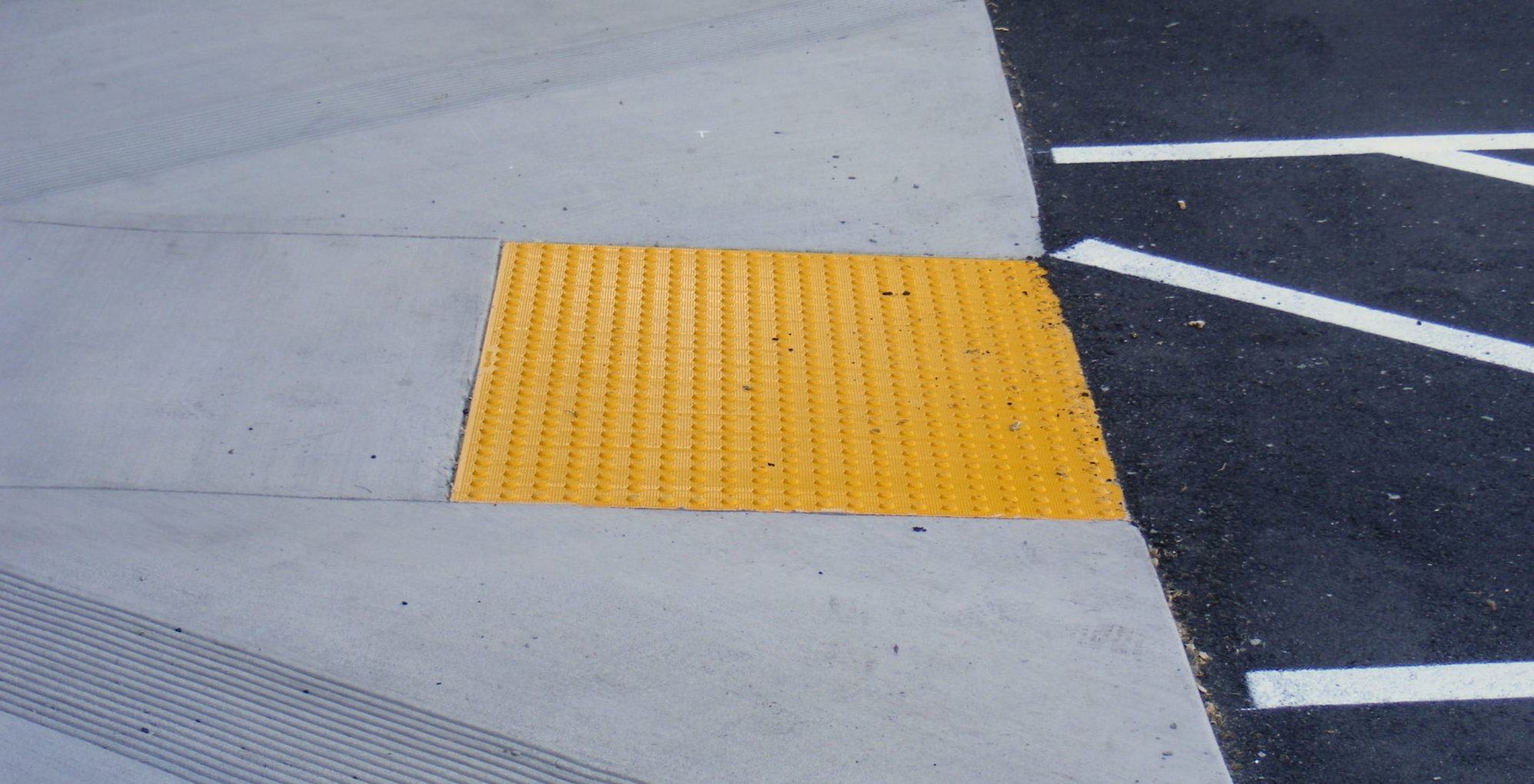
Truncated domes.
EW: Remember that all of the grad students who enrolled in our course were women? Except one man who audited. This really surprised me, especially at an institute with a grad population that’s 65% male. Christine Sun Kim also recently told me that an astonishing 95% of ASL interpreters are women. I didn’t do this on purpose, but the issue’s artists and contributors are overwhelmingly women and nonbinary people; maybe that reflects some of my own bias/identification. What are your thoughts on this as a man and designer?
GC: I think the tendency for designers is to want to do things right, and to want to know that they have been done right using some known metric. This was the crux of the opposition between code and care in the course title. Care means actually attempting to understand all that is at play in a situation—people and other specific elements—and responding to that. I don’t mean to gender code/care as masculine/feminine, but I think it’s necessary to note here that neither mindset is sufficient alone, and that one should seek elements of one within the other in order to understand them.
EW: The world would definitely be a better place if care work were not reduced to feminized labor!
GC: I really love Rod Michalko’s short essay in Jos Boys’ Disability, Space, Architecture: A Reader that tells the simple story of a time that the author, who is blind, is drinking in his favorite bar. He gets up and exits to go smoke at his regular spot, which is leaning against a railing at the top of the steps to the front door; but he bumps into a woman who is hunkering silently in this very place. She had seen him coming, judged that he was leaving the bar, and decided to “hide” out of his way rather than say, “excuse me” or otherwise communicate.
He writes that this interaction encapsulates several deep kinds of ableism. For one, she had assumed that a person with a disability wants to accomplish a single task as easily as possible, in this case successfully navigating the tricky combination of a door and a stair, and thereby overcome his disability in that place/situation. It was inconceivable to her that he would linger and enjoy the location for another reason.
EW: Yeah, or even that he wouldn’t come to a bar as a social space.
GC: Exactly. So, in designing this issue of ART PAPERS, overall I resisted reducing accessibility to a function; say, legibility. I thought of my work as making visual places where it would be nice to hang out without a particular cause.
Proofs of ART PAPERS “Disability and the Politics of Disability”
EW: Yeah. I like that for a magazine, because I definitely did not offer a definitive theory of disability and the politics of visibility, but rather a collection of perspectives you could “hang out” with. I found that so many of the responses to the prompt of “visibility” were actually about refuting easy representation: J.J. Kahn and Heather Holmes’ essays address this head on; so do lots more.
But of course, legibility is still important. Another way we enabled this literal legibility is through online content that includes image descriptions in the alt text, making the work relatively accessible to blind/low-vision audiences who are accessing the material with screen readers that read descriptions of the images aloud. ART PAPERS was already using image descriptions on their website, because it’s not like disabled people only want to read disability stuff. Park McArthur took this a step further: there are no images in her conversation with Amalle Dublon and Constantina Zavitsanos. Instead we linked it to PARA-SITES, the audio guide she made for her [Museum of Modern Art] exhibition. Little things can go a long way, and works like PARA-SITES consider functionality as a space for creativity and criticality (or, art).
We also talked about not treating it too much like a special issue in the sense that special can demarcate separateness. I envisioned the audience of the issue as primarily an art community, which of course includes people who may or may not identify as disabled or be a part of a disability community. It’s a topic everyone can afford to learn more about.
The issue focused heavily on art practices, which is more my field, whereas our MIT course leaned more toward your work in design. Do you want to conclude by describing a few designers in the field who you’re excited about?
GC: Within architecture, the topic of disability makes spaces and places that are not the usual focus of design much more significant: corridors, landings, bathrooms, nooks, waiting areas, et cetera. In my opinion, reclaiming these as political sites and revealing embedded discriminations or presumptions within them is a hugely important task. Joel Sanders’s project Stalled! is doing this for safe and inclusive restrooms. Aimi Hamraie’s historical-epistemological work is, I think, fundamental and absolutely crucial groundwork for new standards of design practice for disability.