Interview: Sam Gilliam
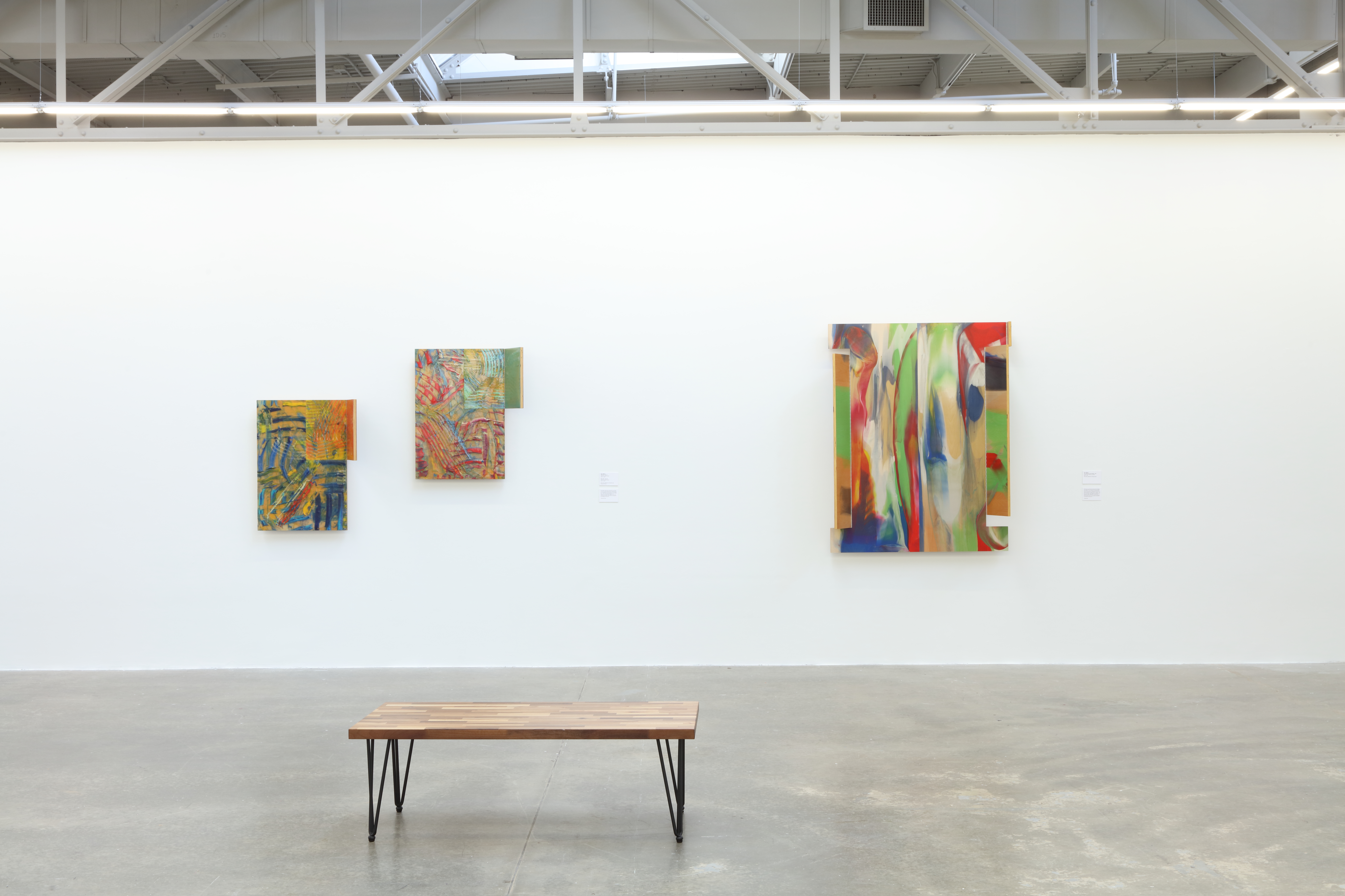
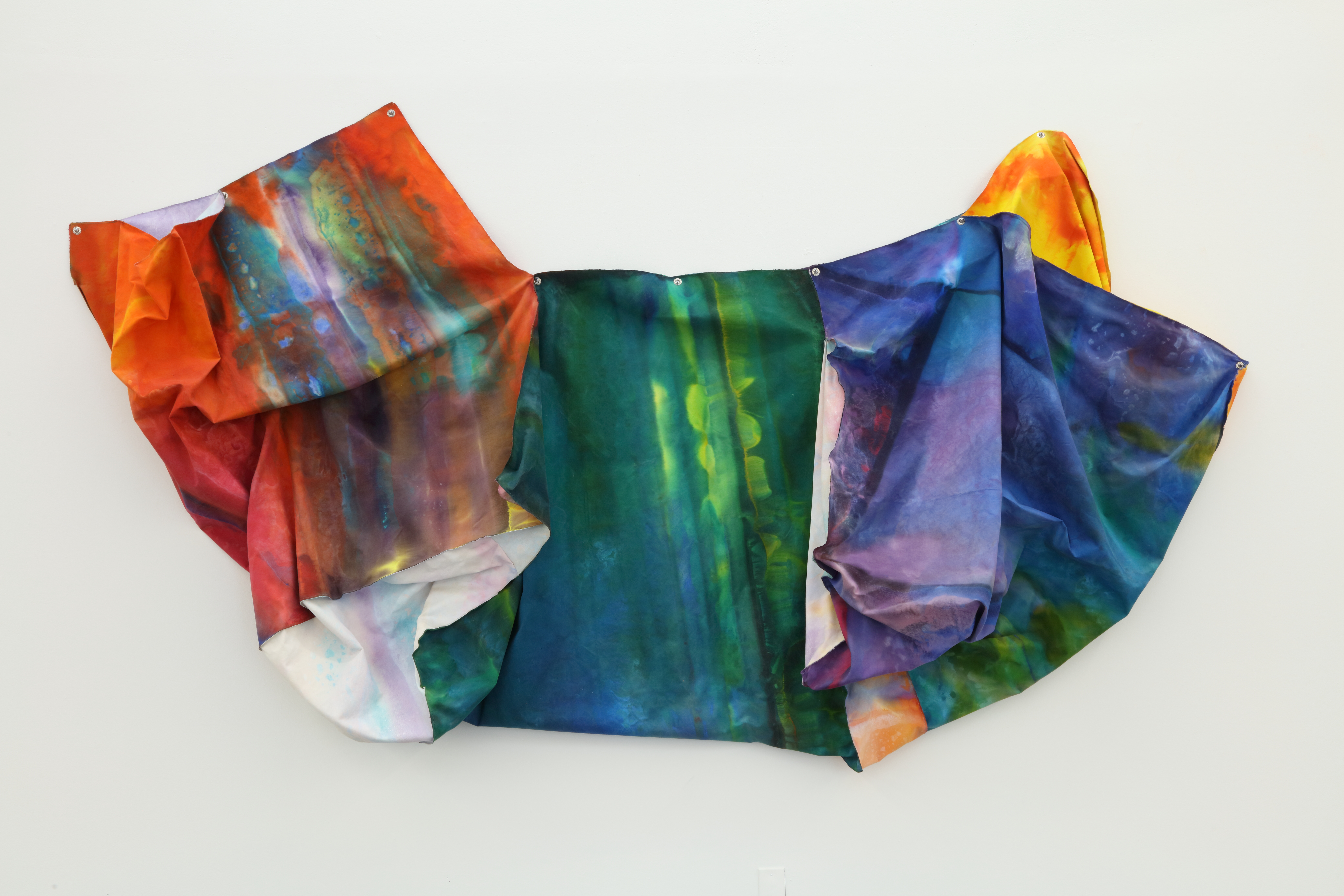
Sam Gilliam, installation view, 2023 [photo: Mike Jensen; courtesy of the artist and Atlanta Contemporary, Atlanta, Georgia]
Share:
This interview was originally published in ART PAPERS January/February 1982, Vol 6, issue 1. Photos included in this interview are from Sam Gilliam, a retrospective curated by Atlanta Contemporary in 2023.
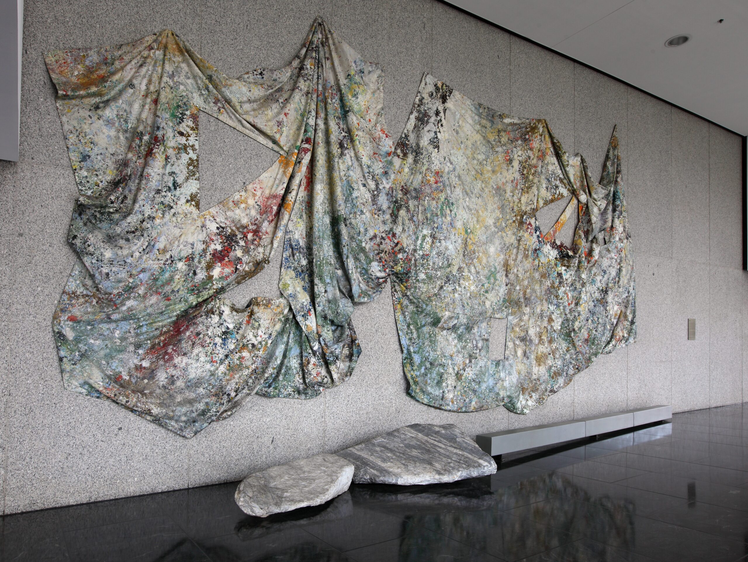
Sam Gilliam’s Nexus exhibition this fall brought the Washington artist to Atlanta for his second solo show here, his first having been at Genevieve Arnold’s gallery in 1978. During the past two years he has created in the city two monumental works in the mode for which he is most famous, his draped canvas “constructions:” Triple Variants at the Richard B. Russell Federal Building, using unstretched awning canvas, a large aluminum beam, and two marble boulders he selected from the Tate, Ga., quarry; and Delta Wave, high over the airline’s baggage area at the Hartsfield International Airport, the separate canvases of this piece bearing cut-out geometric voids as well as metal beams.
Gilliam has been active as a painter in Washington since the early ’60’s, beginning under the influence of the school of color painting associated with that city, which included such artists as Morris Louis, Kenneth Noland, and Gene Davis. By 1969, Gilliam took the process of staining colored pigment into raw canvases, with the strongly material quality it conveyed, to the logical step of suspending it on the wall or from the ceiling, thus exhibiting the sensuous peaks, hollows, and sagging of the fabric. Responsive to several of the aesthetic issues of that time, he thereby not only articulated the process and materiality of the work but also pushed painting beyond its traditional two dimensionality into the definition-busting realm of spatial relief.
Throughout those years and to the present, he has continued to make stretched canvases which while quite different in the images they present nevertheless address some of the same issues: literal and illusionary space achieved through cut-outs and notched silhouettes, as well as overlapping layers of bright color; and painterly substance and process through the thick encrusting of pigment, raked through to reveal underpaint, or sliced to the width of narrow masking tape to delineate geometric forms and fragments. Surface and shape, implied and actual, join therefore the set of themes Gilliam treats. The works reveal a sensitivity to the potential of his artistic means and technical inventiveness, within the confines of what may seem at first to be a reductive aesthetic.
Sam Gilliam: As a concept in my work, installation refers to completion and openness, the work and its place. It locates the work on site, within architectural limits, through spatial and visual arrangements–as a function of color and structure, as intention of the artist, as expression, as perception, as surface or as solid definition. It is not a term that refers to style, although it is primarily abstract in nature. It is not void of an emotional (such as human) relation. It readily refers to the landscape or natural involvement. My use of the term is personal, although not exclusively related to my own work. Precisely, it concerns the way a particular work is established to interact with concepts and space–and to have presence. I feel, however, there is a critical language and a thought process that is critical to a work of art. However, such a language may exist before the work as idea, after the work as comment, and simultaneously as process. I prefer the latter, although I am not confined to such.
Clark Poling: I wonder if you could say something about the kind of planning that went into the Nexus show. Although one might think of the paintings as separate works, they cohere as a very effective installation, geared to the particular space. How did you plan for this exhibit?
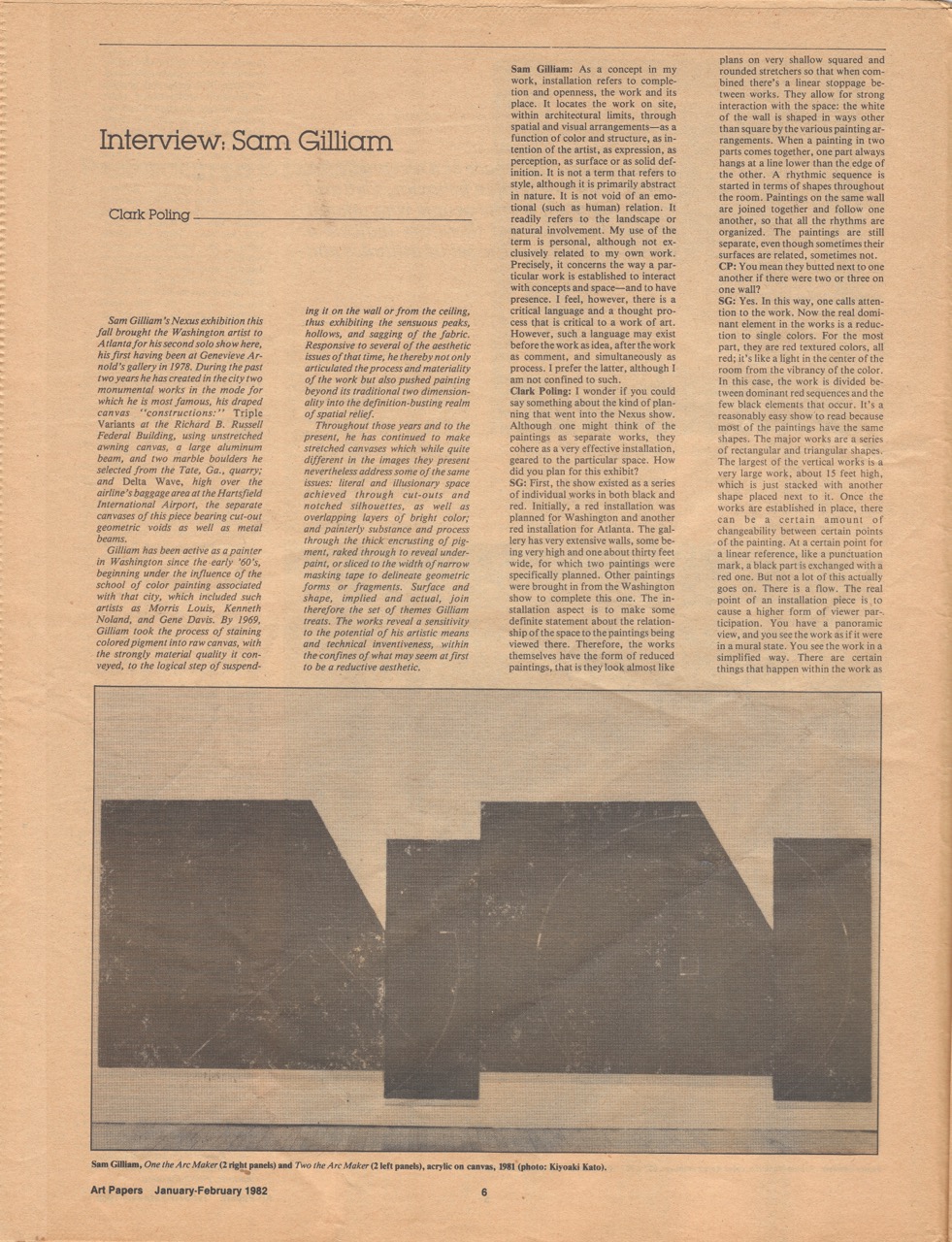
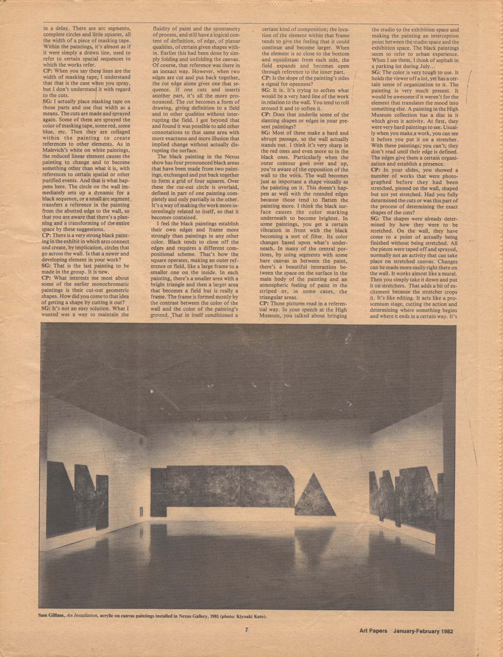
SG: First, they existed as a series of individual works in both black and red. Initially, a red installation was planned for Washington and another red installation for Atlanta. The gallery has very extensive walls, some being very high and one about thirty feet wide, for which two paintings were specifically planned. Other paintings were brought in from the Washington show to complete this one. The installation aspect is to make some definite statement about the relationship of the space to the paintings being viewed there. Therefore, the works themselves have the form of reduced paintings, that is they look almost like plans on very shallow squared and rounded stretchers so that when combined there’s a linear stoppage between works. They allow for strong interaction with the space: the white of the wall is shaped in ways other than square by the various painting arrangements. When a painting in two parts comes together, one part always hangs at a line lower than the edge of the other. A rhythmic sequence is started in terms of shapes throughout the room. Paintings on the same wall are joined together and follow one another, so that all the rhythms are organized. The paintings are still separate, even though sometimes their surfaces are related, sometimes not.
CP: You mean they butted next to one another if there were two or three on one wall?
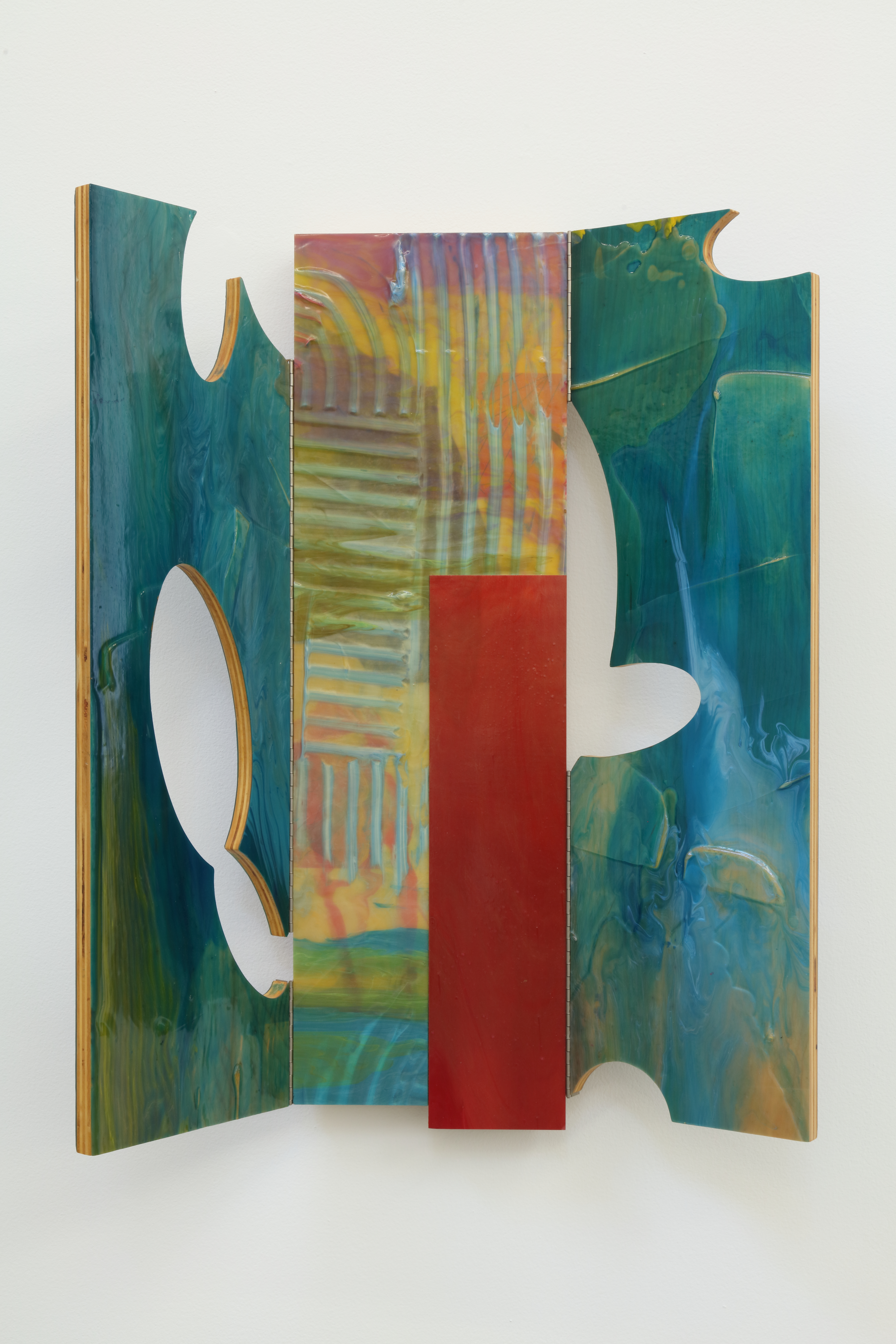
Sam Gilliam, Brief, 1999, acrylic and medium on birch plywood, 36 x 30 x 2.5 in. [photo: Mike Jensen; courtesy of the artist and Atlanta Contemporary, Atlanta, Georgia from the collection of Brenda and Larry Thompson]
SG: Yes. In this way, one calls attention to the work. Now the real dominant element in the works is a reduction to single colors. For the most part, they are red textured colors, all red; it’s like a light in the center of the room from the vibrancy of the color. In this case, the work is divided between dominant red sequences and the few black elements that occur. It’s a reasonably easy show to read because most of the paintings have the same shapes. The major works are a series of rectangular and triangular shapes. The largest of the vertical works is a very large work, about 15 feet high, which is just stacked with another shape placed next to it. Once the works are established in place, there can be a certain amount of changeability between certain points of the painting. At a certain point for a linear reference, like a punctuation mark, a black part is exchanged with a red one. But not a lot of this actually goes on. There is a flow. The real point of an installation piece is to cause a higher form of viewer participation. You have a panoramic view, and you see the work as if it were in a mural state. You see the work in a simplified way. There are certain things that happen within the work as in a delay. There are arc segments, complete circles and little squares, all the width of a piece of masking tape. Within the paintings, it’s almost as if it were simply a drawn line, used to refer to certain spatial sequences to which the works refer.
CP: When you say these lines are the width of masking tape, I understand that this is the case when you spray, but I don’t understand it with regard to the cuts.
SG: I actually place masking tape on those parts and use that width as a means. The cuts are made and sprayed again. Some of them are sprayed the color of the masking tape, some red, some blue, etc. They are collaged within the painting to create references to other elements. As in Malevich’s white on white paintings, the reduced linear element causes the painting to change and to become something other than what it is, with references to certain spatial or other purified events. And that is what happens here. The circle on the wall immediately sets up a dynamic for a black sequence, or a small arc segment transfers a reference in the painting from the abutted edge to the wall, so that you are aware that there’s a planning and a transforming of the entire space by these suggestions.
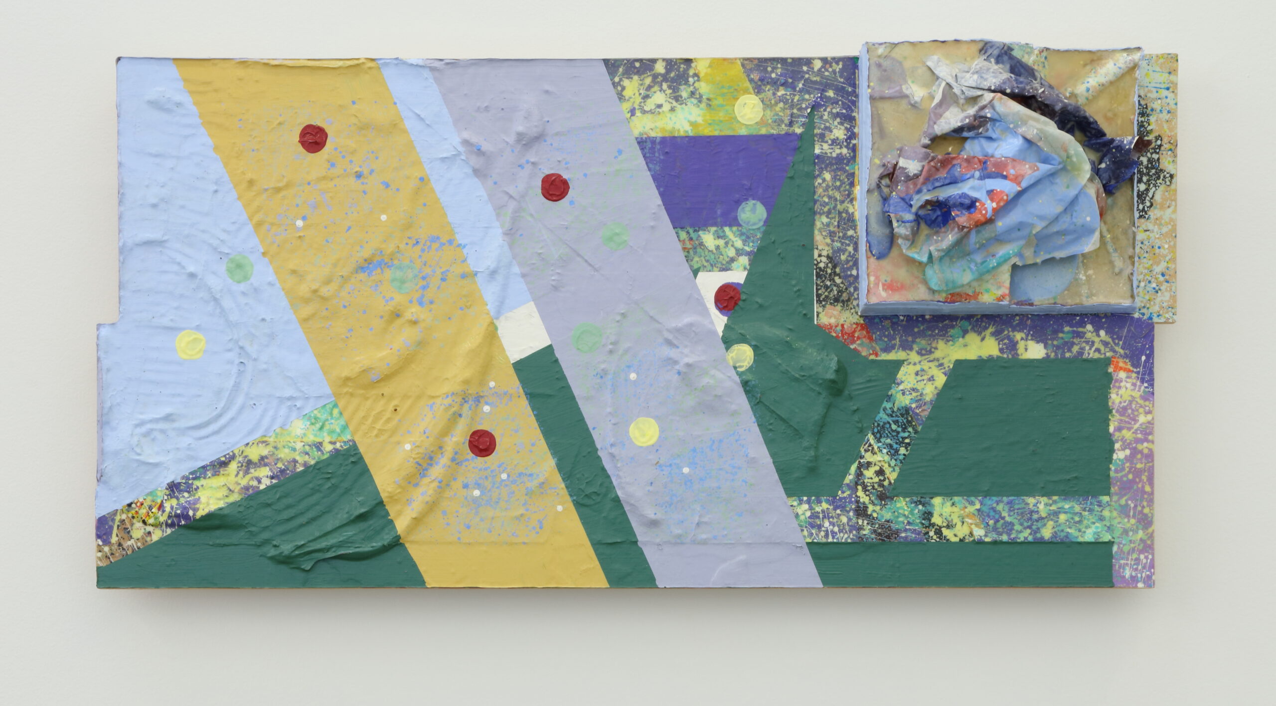
Sam Gilliam, Green Aide, 2010, mixed media on panel, 23.5 x 48 x 8 in. [photo: Mike Jensen; courtesy of the artist and Atlanta Contemporary, Atlanta, Georgia from the collection of Carnetta and Norm Davis]
CP: There is a very strong black painting in the exhibit in which arcs connect and create, by implication, circles that go across the wall. Is that a newer and developing element in your work?
SG: That is the last painting to be made in the group. It is new.
CP: What interests me most about some of the earlier monochromatic paintings is their cut-out geometric shapes. How did you come to that idea of getting a shape by cutting it out?
SG: It’s not an easy solution. What I wanted was a way to maintain the fluidity of the paint and the spontaneity of process, and still have a logical content of definition, of edge, of planar qualities, of certain given shapes within. Earlier this had been done by simply folding and unfolding the canvas. Of course, that reference was there in an inexact way. However, when two edges are cut and put back together, the cut edge alone gives one that sequence. If one cuts and inserts another part, it’s all the more pronounced. The cut becomes a form of drawing, giving definition to a field and to other qualities without interrupting the field. I got beyond that and found it was possible to add other connotations to that same area with more exactness and more illusion that implied change without actually disrupting the surface.
The black painting in the Nexus show has four pronounced black areas that have been made from two paintings, exchanged and put back together to form a grid of four squares. Over these the cut-out circle is overlaid, defined in part of one painting completely and only partially in the other. It’s a way of making the work more interestingly related to itself, so that it becomes contained.
I feel the black paintings establish their own edges and frame more strongly than paintings in any other color. Black tends to close off the edges and requires a different compositional scheme. That’s how the square operates, making an outer reference or field, like a large frame to a smaller one on the inside. In each painting, there’s a smaller area with a bright triangle and then a larger area that becomes a field but is really a frame. The frame is formed mostly by the contrast between the color of the wall and the color of the painting’s ground. That in itself conditioned a certain kind of composition; the location of the element within that frame tends to give the feeling that it could continue and become larger. When the element is so close to the bottom and equidistant from each side, the field expands and becomes open through reference to the inner part.
CP: Is the slope of the painting’s sides a signal for openness?
SG: It is. It’s trying to soften what would be a very hard line of the work in relation to the wall. You tend to roll around it and to soften it.
CP: Does that underlie some of the slanting shapes or edges in your present paintings?
SG: Most of these make a hard and abrupt passage, so the wall actually stands out. I think it’s very sharp in the red ones and even more so in the black ones. Particularly when the outer contour goes over and up. You’re aware of the opposition of the wall to the work. The wall becomes just as important a shape visually as the painting on it. This doesn’t happen as well with the rounded edges because those tend to flatten the painting more. I think the black surface causes the color marking underneath to become brighter. In some paintings, you get a certain vibration in front with the black becoming a sort of filter. Its color changes based upon what’s underneath. In many of the central portions, by using segments with some bare canvas in between the paint, there’s a beautiful interaction between the space on the surface in the main body of the painting and an atmospheric feeling of paint in the striped or, in some cases, the triangular areas.
Sam Gilliam, Jimminy, 2010, mixed media, 49 x 83 in. [photo: Mike Jensen; courtesy of the artist and Atlanta Contemporary, Atlanta, Georgia from the collection of Johnny Howze III]
CP: Those pictures read in a referential way. In your speech at the High Museum, you talked about bringing the studio to the exhibition space and making the painting an interception point between the studio space and the exhibition space. The black paintings seem to refer to urban experience. When I see them, I think of asphalt in a parking lot during July…
SG: The color is very tough to use. It holds the viewer off a lot, yet has a certain sense of organization to it. The painting is very much present. It would be awesome if it weren’t for the elements that translates the mood into something else. A painting in the High Museum collection has a disc in it which gives it activity. At first, they were very hard paintings to see. Usually when you make a work, you can see it before you put it on a stretcher. With these paintings, you can’t; they don’t read until their edge is defined. The edges give them a certain organization and establish a presence.
CP: In your slides, you showed a number of works that were photographed before they had been stretched, pinned on the wall, shaped but not yet stretched. Had you fully determined the cuts or was this part of the process of determining the exact shapes of the cuts?
SG: The shapes were already determined by how they were supposed to be stretched. On the wall, they have come to a point of actually being finished without being stretched. All the pieces were taped off and sprayed, normally not an activity that can take place on stretched canvas. Changes can be made more easily right there on the wall. It works almost like a mural. Then you simply take it down and put it on stretchers. That adds a bit of excitement because the stretcher crops it. It’s like editing. It acts like a proscenium stage, cutting the action and determining where something begins and where it ends in a certain way. It’s not an arbitrary process. It’s the desired process in a way.
Sam Gilliam, installation view, 2023 [photo: Mike Jensen; courtesy of the artist and Atlanta Contemporary, Atlanta, Georgia]
CP: That question of cutting brings up the issue of those edges again. One of the interesting things about this show is the distinction between different kinds of edges. In some of your earlier paintings, of course, you used slanted edges.
SG: Yes. In recent years, I’ve used certain kinds of beveled stretchers. In the earlier kind, the canvas appeared very flat because the stretcher tapered back behind the canvas surface and was seen only as an edge. More recently, the edge is beveled away from the wall, so that the hard edge on the front is surfaced; that florets it off the wall. It’s softened from front to edge and appears to float in front of the wall.
The depth is decreased with rounded edges; the rolling produces a soft effect. The abrupt movement into the wall ceases, and the thing seems to translate more easily. Also, they roll from one segment to the other. Where a shape ends on the edge, it’s allowed to roll right around. There is a continuation, so there is no line. I guess this is a form of disguised edges—there is no line between where the painting really ends and where the wall ends. Everything is rather transitional. You go beyond the painting.
CP: How is that related to having two different kinds of edges in one composite work?
SG: As in the ones at Nexus, the structures are made in a different direction altogether. Most of the edges form a crevice when they come together, calling attention to themselves, like a very heavy mark or a shadow. It indicates that the work is made of separate parts, one part that naturally seems flatter than the other (because of being squared) and seems to sit on top more. The depictions of the elements is more clearly defined in relationship to the wall and therefore the wall is defined quite differently.
CP: Did you have any plan or measurements for the gallery while you worked?
SG: Yes, I had plans for a long time, actually even before they had closed off the two windows at the opposite end. We knew precisely the number of paintings to send and that the longer walls could take a long painting, up to 30 feet, and that one wall could take a very high painting.
CP: It looks as if the show had been planned for the particular space, and one can tell that the works were adapted for this installation. One of the most interesting things to me was your use of the projecting and inner corners of the room.
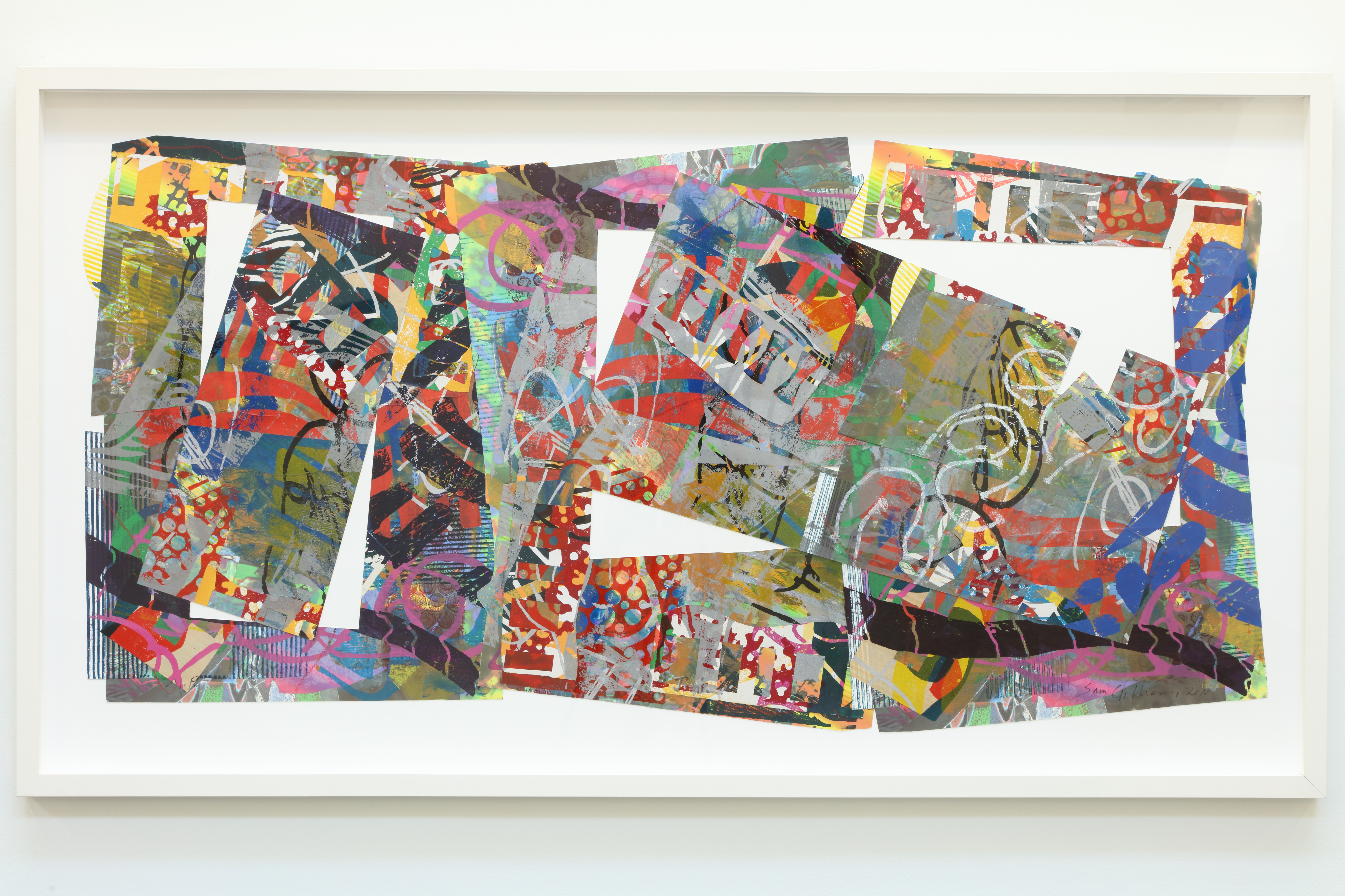
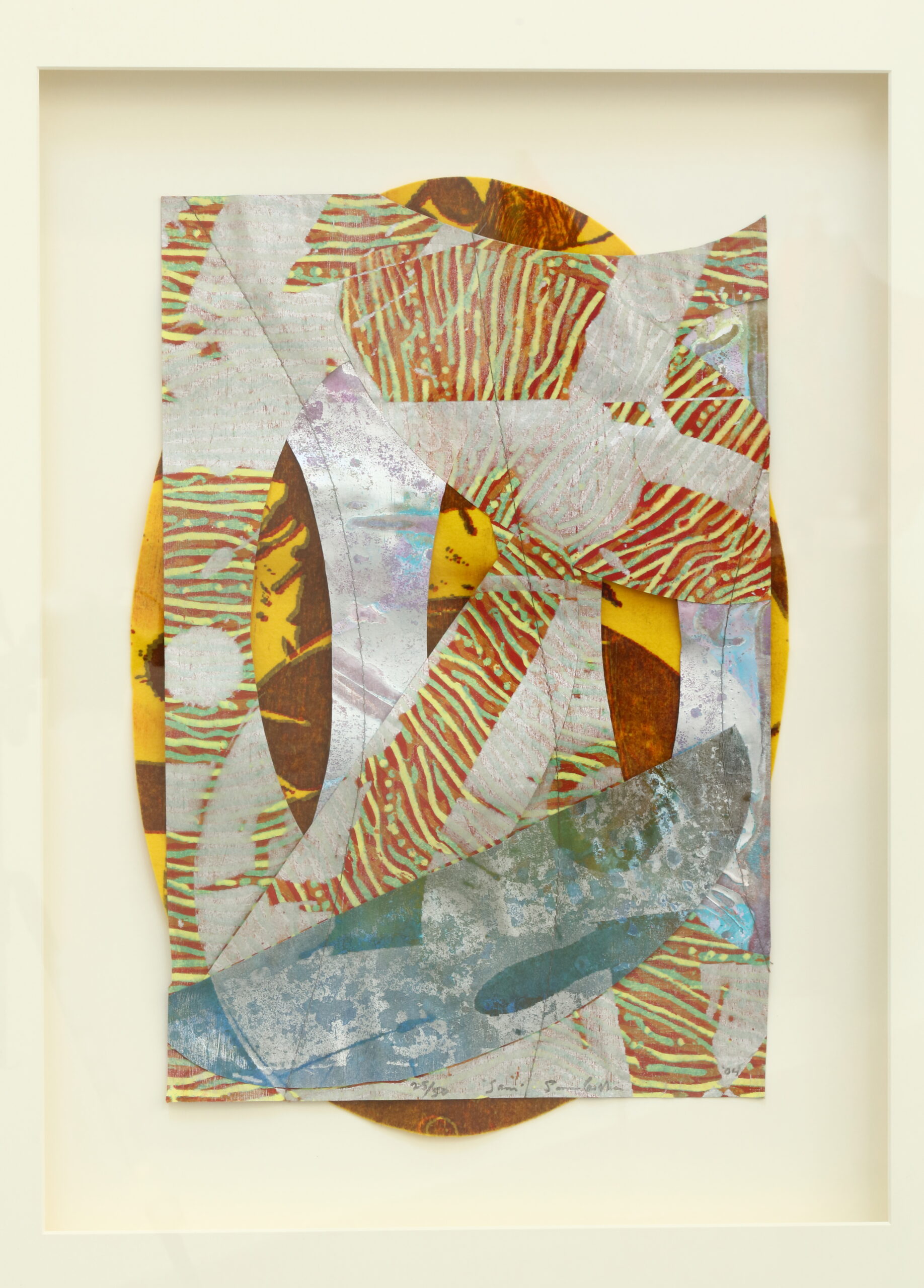
Sam Gilliam, Sam, 2004, print on paper and felt, 15 x 20 in. [photo: Mike Jensen; courtesy of the artist and Atlanta Contemporary, Atlanta, Georgia from the collection of Yolanda Lynch]
SG: That happened primarily in the Washington show. Although I didn’t hang this show, the slides I made in the studio set up the possibility that this would happen. In fact, when something happened that I had not suggested, I got a very worried call from the airport, it was the first thing the gallery staff wanted to show to me. It didn’t matter that much if it had changed from the original plan. It does matter when a change affects the relationship between paintings if it destroys a certain progression or causes a different accent. Of course, I was very careful about making certain that actually worked.
CP: Are you pleased with how the exhibit worked at Nexus?
SG: It’s held up thus far. I’ve thought of a few changes I would make, but not in any major works. In general, I’m very satisfied. I like the feeling of the works in that space in daylight. The energy of the paintings’ surfaces is captured even though the colors are mainly monochromatic without a great deal of recession. They’re simplified colors, almost like two colors in some of them. Particularly in the red paintings, the sweep of daylight establishes different levels of surface and tends to break up the implied flatness or the abruptness of the stretched shapes. Sometimes they feel like leaves on the ground rather than paintings on canvas, and I think I like that.
CP: In addition to their planned architectural quality, one of the paintings’ strongest qualities, I also felt a very map-like presence.
SG: My reference is to space, involving open spaces of canvas and how these shapes are experienced as larger by the inclusion of the wall as part of their make-up. For example, the simplest one is the circle and refers to marking on the surface of that canvas, but suddenly there’s that wedge that interrupts it. One can complete the shape because the circle rhythm continues below and is completed on the wall. Other paintings allude to the potentials of shape and to elements breaking into the ceiling. Sometimes you see these different relationships as some setting up possible triangles or relationships that do other things. It’s close to drawing on a wall, in a sense. A lot of painting does this—the best of paintings, painting that is also a part of life, painting that does not try to make itself into a little window in a wall but that becomes part of its surroundings.
CP: The environment at Nexus is a very strong one. Someone at the opening said that it was the first time she had been in the gallery space and not been tempted to look at its beautiful ceiling. That was because there’s strong architectural function in the work.
You’ve had a lot of experience in Atlanta with a solo show at the Arnold Gallery in 1978, several public commissions, and now this large show at Nexus in addition to your lectures at the museum. Do you find Atlanta a good town for your art?
SG: Oh, yes.
Sam Gilliam, Atlanta, 2003, acrylic on birch wood, 72 x 144 x 8 in. [photo: Mike Jensen; courtesy of the artist and Atlanta Contemporary, Atlanta, Georgia from the collection of Greg Head]
CP: We have all been interested in the brouhaha over the work in the Richard Russell building. It seems that a kind of myth has been generated. Myth has functioned in art history through the ages, but there seems to be a new one here. Would you comment on the repeated false stories about workmen mistaking your work for a dropcloth?
SG: It never happened. Subsequently, there were a lot of myths created through a number of media. That kind of poking fun goes on and has gone on in art all the time. Initially, I think there were several things that were more disappointing earlier. When I finally got the piece up here, I left very, very pleased. The way the work became a subject of controversy was disappointing, simply because people had no other way of solving grievances about the building. First, the judges rejected the possibility of putting that work on the 23rd floor, and their rejection was that it had nothing to do with the judiciary process. At that point, the initial issue would have been, ‘Does anyone really have a right to limit an artist from doing what he wants to do?’ Their argument was not against me, but about no one having paid attention to what they really wanted there. What came about as a result of this didn’t change my mind about wanting to work in public areas, but it has begun to shape my thinking of who is right and who is not in terms of authorship and responsibility. To a certain extent, I listened very carefully when someone said that the controversy was the best thing that could happen—that someone created the myth about the piece. To a certain extent, that kind of involvement is part of art also, and you should pay attention to it. It ended successfully here, but it made me realize that a work of art in a public space is not the same as a work of art that’s not. The concept of installation includes art that operates particularly between place and viewer. One of my pieces was to go over an escalator, so it was made with the feeling of being able to ride into the piece. I also wanted to consider what would happen to that work in the viewer’s mind when it was seen day after day. I wanted detail that revealed the making of the work, something that might be said to be entertaining, something that might be mysterious. This has permeated a lot of my thought and made me think in terms of a piece more well rounded perhaps. The Russell building piece embodies a certain, very direct way of solving problems of trying to introduce specific object relationship, a frame of reference and a pictorial reference.
Sam Gilliam, Triple Variants , 1979, Mixed media, 15′ x 25′[photo: Carol M. Highsmith; courtesy of Wikimedia Commons]
CP: With the aluminum beam?
SG: With the beam, the marble boulder, and the piece itself. That is a benchmark piece. While you can’t really go beyond that, you can ask what is the context in which the work is seen? If it offends, what role does it really play? How does one better consider the context in which it will be seen? Some things can be solved simply by education, some by better solutions of legal problems, and some by the way pieces are introduced to the public as being important to them, not just being placed there. A workman at the airport told me that the reason he didn’t like the pieces that were going up was no one told him anything about them. Everyone made it only for the people who already knew. An artist must consider, to a certain extent, what point of view he has to operate against. Sometimes you make some works in opposition to taste that you know will get a reasonable amount of discussion. Sometimes you want to be discussed that way. Sometimes you want to attack not only someone else’s sensibilities but also your own. That works in the gallery context, but on the outside, there’s a different arrangement. I begin to think that that’s why Calder is such a great artist. The amenable quality of motion makes the pieces accessible to viewers. Oldenburg is a reasonable artist in that his images translate themselves in a certain way. This happens in a good building or in amusement parks that create a certain condition. These factors have to be considered in making works of that kind.
CP: What about your work in the Atlanta airport? That is a piece that brings together a lot of elements in your recent art, with fabric and cuts to make different shapes, the beams, and a great deal of color variation. Does that piece represent an evolution in your work as a result of your insights from the elevator piece and its repeated viewing by the public?
SG: I wish I could go on finishing that piece. Two years later its one limitation is its lighting. Because it’s not lighted, it just stays there up on the wall. If it were lit, the wall would interact with and become part of the piece. Improperly lighted, it doesn’t gain proper scale. If I knew it was always going to have that lighting, I’d like to add a big ring to project in front and to establish scale, so that it wouldn’t matter if it were lighted or not. A single element of scale would be like a barker introducing a circus. It is very important that this introduction happens. Presentation may not be as important in sculpture as it is in relief pieces, but having an introduction out from the wall and into space seems meaningful to me. I’m beginning to think that’s one of the things that should happen—at least in this piece under these circumstances. If it’s going to exist under certain conditions, there should be a way to adjust it to those conditions. None of us thought it would stay without lighting.
CP: My experience of the piece is that it’s very lively and vivid in daylight.
SG: It seems too small because it’s squashed by the wall and the wall is so dark. In another piece, for instance, the circle at the bottom establishes an immediate small scale of reference, a prelude to something else. In two years, the drama, the sense of presentation has increased. I feel lucky that the Russell Building starts with separate elements. It’s much like the collage pieces, like a painting with a camera hanging in the center. That kind of crazy thing calls attention to itself. This has become a factor now in building models for several pieces. I’m more aware of constant relationships that begin to add up to a system of things going on. Of course, that is precisely where I think things are going.
Clark Poling was an associate professor of art history at Emory University.
