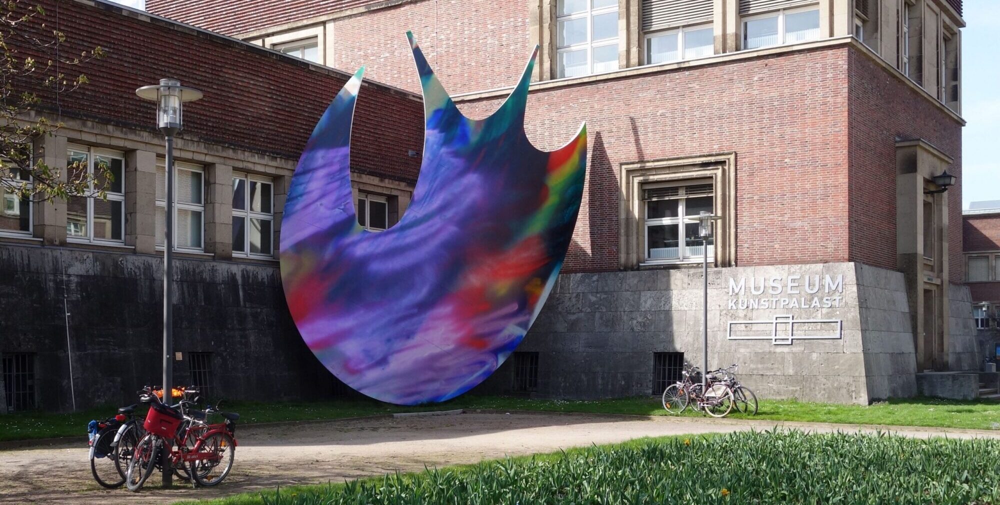
Katharina Grosse, Ellipse (outside Museum Kunstpalast), 2009 [courtesy of wikimedia commons]
Katharina Grosse: Lush Irreverence
Share:
This interview was originally published in ART PAPERS September/October 2008, Vol. 32, issue 5.
Katharina Grosse arrived on the international scene when she first picked up a spray gun in 1998 in the project room at Kunsthalle Bern in Switzerland. Vulgar, immediate, immersive—Grosse’s color-saturated installations defy scale and volume, architectural decorum and gallery manners, frame and brush.
By the mid-1990s, her work was already beginning to move off the canvas, onto the wall, and out of the gallery. While some critics have compared her irreverent monochromes to 1950s color field painting, they pointed ahead to the ironic quotes of Wade Guyton rather than back to the lyrical strokes of Mark Rothko or the wonderfully awkward abstractions of Richard Diebenkorn.1 Grosse’s post-graffiti, neo-punk kinetic maps of color don’t inscribe the movement of the painter’s body à la Jackson Pollock. Instead, they are about the outsizing of the body, that is, they stretch far beyond any fixed signature. Drips of paint jest ironically with abstract expression: less expression, more analysis—of scale, time, and mood. Grosse’s work spatializes, rather than localizes, visual vocabularies. In this, it recalls the effect that sound has upon us when we walk into a room. In addition, her work avoids reducing affect to an artificial spectacle of abstraction. Instead, it uses affect as a cool tool that can turn, at once, hot and cold. Her first experiments with spraying her own bedroom signaled the beginning of her use of objects in aggressively performative ways—personal items such as her bed, her computer, her desk, and her clothes were soaked with acrylic. Since then, nothing is spared: she treats books, undergarments, and piles of soil with equal valence, and equal disdain for their cultural value. Even when she seems dangerously close to a romance with color, architecture or design, Grosse flips the conceptual game so that her projects exhibit a razor-sharp awareness of their possible aestheticizing effects.
Grosse studied at the Kunstakademie in Düsseldorf from 1982 to 1990, when the program was heavily influenced by photography, film, and video.2 At a time when painting was pronounced dead, Grosse gave the medium a transfusion by exploiting the tensions between photography and painting, architecture and installation, politics and poetics. Her first solo exhibition in the U.S.A. were Cheese Gone Bad at the Chinati Foundation in Marfa, Texas, where she was artist-in-residence in 1999, and then at the Hammer Museum in Los Angeles in 2001. Both shows allowed her to debut her signature spray gun projects, transforming each building into a hauntingly luminescent site. Since then, her painting installations have intervened in architectural structures as grand as The Renaissance Society in Chicago in 2007 and the FRAC Auvergne, Clermont-Ferrand in 2008.
Cash Ragona: I’d like to start with the concept of “equalization space” at play in your work. What happens when color saturates all surfaces and architectural features of a particular space? How are you thinking about space—especially when every part of the room is covered by color?
Katharina Grosse: Well, I am not merely covering something, but I am also painting a painting. I am actually establishing—at once—a fictitious space, an illusionist space, and a painterly space. It is also a pictorial event, an encounter with a particular architectural structure that has three dimensions: a ceiling and two walls, and even an object, such as a window. At the same time, even though I do paint a painting on a somewhat sculptural surface, I also break up the borderlines between objects: the different walls, the windows, maybe even bookcases or other objects like clothes or chairs, whatever happens to be in that situation or whatever I happen to include willingly into it so as to show that I do all these things at the same time. So, I don’t only paint a painting— which is to establish an illusionist mental space—but I also have it coincide with a set of rules of a meta-realistic space that is completely excluded in painting. I also break up the object hierarchies by dissolving the borders so that the chairs, the window, and the wall all turn green with one kind of movement, with the spray gun. But at the same time, you can still see these differentiated forms. It goes back and forth: you can name and distinguish these objects from one another and simultaneously you have the experience of not being able to tell them apart from one another. This is what you might call some kind of equalization.
CR: In the late 1990s, you seemed to be interested in monochromes. The work was almost one color—like Untitled, in 1998, your installation for the Biennale of Sydney at the Art Gallery of New South Wales, which was an open painting on walls. There was no ceiling and the walls appeared to be all one color, like all green or all orange. Later, you began experimenting with multiple colors.
KG: Well, you might want to recall that I had a traditional education. So, I did all sorts of things. I did landscape painting, very large portraits, and then at one point I began thinking: should I really paint what I see or should I start from somewhere else? I felt really uneasy being restricted by the object and the pictorial surface. For example, whenever there was a nose, I had to stop my movement and actually do something that makes us understand that there was a nose [laughter]. So, I was fighting with this need to depict—depict in the sense of naming, of making things nameable. And there was this moment when I asked: what else can I do? Then I just painted something that felt completely lost. Later, I thought let’s get back to the most basic elements of painting, like paint or color: use one or two colors. Then you have the sizes of paint brushes; then you have the surface. And so, without being so aware of it, I was re-experiencing the things that radical painters like Marcia Hafif or Joe Marioni had redefined. But, I had different motivations. While the monochromatic turn in my work did look like Hafif’s for a short moment, my reasons for doing it were different. For me, at the moment when I was painting subject matter, it was about giving my work a center point. I wanted to give myself some sort of theme. And I started to be interested in doing only these very simple movements. I began to build from there. And I went in a direction that was very different from the monochrome painters or the minimalists who kind of moved in one direction, focused on one thing, conveyed toward one kind of solution and no other. Whereas my work started out from that one point, it then opened up or began to include other foci. My process was one of inclusion rather than exclusion. While I did have this one point in common with these monochrome works and thoughts, I went from there. I didn’t move towards it.
CR: Was it not also a movement into space, especially apparent in the Sydney installation where you painted in a room without a ceiling? Was the idea that the painting would continue off the wall, or the canvas and into a more ephemeral space? Was that part of the focus of this particular work? Was it a conscious gesture?
KG: No, I was not conscious of it [laughter], but you do point at something that was somehow the basic idea of that show. But I think you are talking about another show at a small place, in the north of Germany, Nordhorn.3 The exhibition was held in an old factory building, made out of concrete, a very early concrete structure of the twenties, a beautiful yarn factory. They built an open structure inside, which made it possible to do a painting without a roof. It was very much like a modernist structure and we all painted on the unfinished building. The show opened before the building was in full operation.
CR: In one of your recent shows, you painted the floor and walls white, almost whitewashing the room, in order to create a background layer. Then you placed the canvas paintings on top of it, giving the effect of a larger, layered painting. Can you talk about the relationship between canvas and wall works?
KG: The canvas works never really lay on it—they were part of the installation. Sometimes I start out with canvases that are already like a finished painting, in a sense, from the studio. Sometimes I bring blank canvases and I lean or hang them somewhere. Then, I start working on the installation and I paint these mobile structures on the walls and so on. And sometimes I move the canvases somewhere else. In the case of the show you mentioned, FRAC Auvergne actually asked me to do two shows in a row in the same room, which is really rare. It was a very bizarre invitation: who can afford to do two shows in a row by the same artist? [laughs] This is a very interesting little institution in France. It is very dedicated to contemporary painting.4 It is an old medieval structure with huge pillars made of brick, technically well-made masonry, which means I couldn’t do so much in that space because its architectural structure was already so prominent. I made a wall and floor painting, which I then painted over again, and I installed drawings on it. That was the first time I actually hung drawings over an existing wall painting.
CR: They are usually a part of the institution.
KG: Yes, and they are usually fairly big. These drawings are small. I wanted to integrate a very small, condensed format into a show that was actually, in terms of its surface, quite large. I wanted to have these different containers of different densities juxtaposed in the show.
CR: So that they serve as different entries into the space.
KG: Exactly. But this whitewashing also came from an earlier work where I painted a storefront in a small Dutch town as part of a very interesting multi-site project by the artist group Franchise. They were given about ten different stores in ten different cities in Holland and they invited people like Olaf Nicolai, Liam Gillick, all sorts of people who work with space and its social architectural implications. I was the only painter who actually did something outside the stores. My storefront comprised three stores that were not connected with each other. So, I wanted to do something on the windows and on the brick wall. I just painted it white using an airless gun, which is very big and efficient—in two hours, you cover the whole thing. People were completely amazed and shocked. It triggered all sorts of reactions. After two weeks, they asked me to remove it.
CR: Really?
KG: Yes, that little neighborhood responded very aggressively. My work created quite the controversy because, in such a beautiful, historical city, people were afraid that my work would trigger a rash of graffiti on the medieval walls [laugher] I said, “Okay guys, I am going to use white and it is going to look beautiful.”
Many had all sorts of different reservations about the work. Some said it was terrible and ugly, others said it was unfinished. To some, it was really only just like a coat of primer. It generated a huge discussion. I had newspapers calling me. It was weird. Very interesting.
CR: It probably both opened up and negated the space at the same time, right? Because it’s white…
KG: Exactly. It negated it, but it also looked like also snow or light. Artificial light. These streets are very narrow and dark. This white “thing” just lit up the whole situation. It was very beautiful. I was surprised.
CR: Yes, I also loved the way it looked as the backdrop in that show.
KG: It also addressed the idea that you “paint over.” You don’t destroy your work, but you just paint over it.
…I am very interested in structure, but every artist is. You have to find out how you want to communicate and what you want to do. You know what you want to say, but you have to understand how to say it—that’s the formal issue. We often talk about formal things, and people think that this is all about formalism—but it is not. However, it’s our preoccupation when we make it work.
…There is the moment when you have to assess whether your structure is connected to primary thoughts, to your primary interests somehow. I don’t know whether that works if it really is just an isolated structure. What premises would you base your decision on?
CR: Is feeling or affect a part of this?
KG: Of course, it’s a huge part. But it’s just the basis. It is filtered, I think. We use an artificial structure to filter the feeling, emotion or sexual longing, that is, to transcend it. In my case, I invent formal layers in order to return to some very direct means. Otherwise, I would be abstracting these things. Then I would have the Kandinsky problem—he had to name these things and to actually build a relationship with the different affective-abstract parts with which he was dealing. By contrast, I transform these structures back into some kind of raw data.
CR: Can you really control everything that goes on—especially when you are spraying?
KG: Oh, you can.
CR: What about the drips?
KG: You can make them more pronounced, or you can avoid them. That’s completely controllable.
CR: Oh? You think about the drips?
KG: I make them on purpose.
CR: You do? Can you talk about that?
KG: Oh, that’s very easy [laughter].
CR: When I see “drips,” I immediately think of Abstract Expressionism and, of course, Jackson Pollock. And you know the problem Andy Warhol had when he first painted a Coca-Cola bottle. He painted two versions, showed them both to the filmmaker Emile de Antonio, and asked him which one he should exhibit-the one with or without the drips? De Antonio told him to destroy the “brushy one”, the one with drips. Though this anecdote had been exaggerated into myth, Warhol certainly took the more as-like dripless direction. It served to cut him off from that Ab Ex tradition from which he was struggling to be independent. Drips—especially in the U.S.A.—just point so directly to that specific moment in history, to feeling and that inner, profound abstract expression. What do they mean to you? Why and how do you use them? What role does chance play? What’s the relationship between chance and structure?
KG: When people say this person who makes a line with a ruler has a rational mind whereas one who uses drips is fluid is the emotional one, it is like—
CR: Cliché
KG: Yes, I am more ironic about it. The drip points to some kind of overstated lushness in painting. I also use it to indicate incompleteness—as in, this painting could still be wet. It points to the idea that a painting is still in the process of doing something, as opposed to being finished. It adds a certain sexuality to the work as well. In some situations, it allows for other kinds of color mixtures. There are lots of reasons why I use it: it introduces the line into the work, which I don’t have otherwise. It also indicates the effects of gravity and how different planes are directed toward one another. So it has many different purposes—it’s very useful.
It’s a tool that changes according to how I use it. For example, if I use dripping paint on a sculptural object, which I then upend, I turn gravity upside down—it has a completely different meaning in that context. And of course, I also grew up with the idea that the splash or the drip is a result of painting activity—it indicates that someone was painting fast and spontaneously rather than slowly and contemplatively. Trashy, fast, and vulgar—like the 1980s New Wild painting of Berlin or Cologne [Neue Wilden, also known as the New Fauves]. In the work of Walter Dahn, Elvira Bach, Rainer Fetting, Jiri Georg Dokoupil, and others, the drip was the thing, whether in oil paint, enamel paint or whatever, it had that same connotation. It didn’t come from Pop art. It came from a completely different history—it was reinventing the expressionist surface. I did grow up with that. We were sitting in the studio thinking, “shall we accept the drip or shall we not?” [laughter]—it’s a graphic invention that has a lot of different meanings according to its context.
CR: Does it say anything about your body? For Pollock, it was very much about the movement of his body over the canvas.
KG: What I do is bigger than I am.
I shift scale a lot in my work. And this is why the drip is so interesting. It introduces the matter-of-factness of what paint can do. It’s an anti-illusionist device. My work has a lot of iconic fragmentation in it, in a sense. I adjust my body to the situation I am in. If the space is really large, I need a scissor lift or a boom lift. I get bigger and bigger: I inflate myself. The spray gun is already a tool with which I inflate myself. Whereas the drip can’t be enlarged—you can’t make BIG DRIPS [laughter]. That is a very interesting thing, no?
CR: It is. You are putting an ironic twist to the drip insofar as it used to connote the body and its presence. In your work, it signifies distance. It doesn’t necessarily, in fact, mark your body, right?
KG: Yes.
CR: In a way, it is a notation for the absence of your body. An ironic notation?
KG: Yes, and this distance—the ironic notation, as you say—is a necessary ingredient. I use it in order to break a dimension of my work: its emotional and romantic background. Romantic irony is a very important tool that allows you to understand your existence and your thoughts on your life and surroundings.
CR: Now, I want to focus on the idea of scale.
When I went to your studio the other day, I saw these newer paintings—they are enormous. You first lay them on the ground. Then you put dirt on a particular area of the already painted canvas, and you let it sit there for a while?
KG: Right.
CR: In Germany scale is historically so important—well, in the U.S.A. too. But here, I always think of it in relation to someone like Anselm Kiefer. There is almost the sense of die Große Deutscche Malerei [Big German Painting], you know, Landschaft [landscape]—and other culturally loaded terms. I wonder if there is a danger in newer work in that way. I looked at the new canvases and thought, “wow, this is grandiose.” It’s like a “master work”—it implies Landschaft. In my mind, this does not happen with spray, which has more of a relationship with graffiti. It’s much more open. And you can’t call it a “big painting.” Well , you could, but it is also more than that. Can you talk about that? Do you think about it? Do you get worried when you look at the newer work?
KG: This brings up many different questions. Size depends on the context. If you place an oversized painting in an even larger space, then the painting looks small. It’s more like magnifying certain things so that they become more visible.
CR: Looking at the larger paintings, I thought: landscape and beauty. When I think of the spray gun works, I also think of two political paradigms. One is more representational and romantic; the other is in-your-face, anti-establishment—you know, all the clichés attached to the graffiti mark. But you don’t see them as oppositional, right? They are more part of the same project?
KG: Representational, because?
CR: Well they look like landscapes to me. Abstract landscapes, but nevertheless.
KG: Representational? You mean they represent abstract landscape painting?
CR: And because you use dirt as a material, literally using nature—or a natural material—to have an effect. It’s not total artifice, I guess.
KG: It is total artifice, it incorporates the notion of a pseudo-realistic element. My work emphasizes the tensions implicit in combining multiple, incongruent structures: grandiosity and small gestures, the politics of space and placelessness.
CR: Your new work is very exciting. But let me ask you, since I had not experienced it until recently: when you paint over dirt, like a mound of dirt, you simply paint right over it as if you were ignoring it, right? Whereas, its removal seems like the reverse: you are using it to open up the possibilities of the materiality of paint. The mound paintings imply a fuck you to nature, that is, “I am just going to paint right over this precious earth.” [laughter]
KG: There is this level of ignoring nature—it’s very strong.
CR: How did you get interested in bringing soil into the studio?
KG: It came very naturally. I felt like doing it. I tried it and it worked out very well.
CR: When did you begin using it?
KG: Maybe two or three years ago. The Poise of the Head und die anderen folgen, 2004, in Düsselfdorf was the first piece. I used it because I wanted to prop up a painting—a smaller canvas painting. I didn’t want to have to hang the painting or lean it on the wall, while it was standing on the floor. So I propped it up against this pile of dirt. I also thought it was better if it was larger. It looked very beautiful from the upstairs—the gallery had two, open levels.
CR: Your idea about scale is so interesting, because there is such a limited vocabulary related to thinking about scale. Have you heard of these recent shows in the States—Unmonumental at the New Museum in New York and The Uncertainty of Objects and Ideas at the Hirshhorn Museum and Sculpture Garden in Washington, D.C? Several young sculptors deal with scale—that is, make their work appear unmonumental—by resisting large, slick, over-rationalized construction. The New Museum overemphasized this stilted tenuousness of materials and spontaneity of approach to a fault. So, even though there were many good pieces in this show—by Rachel Harrision, Urs Fischer, Gedi Sibony, Nobuko Tsuchiya and others—the installation did not do them justice. In fact, it homogenized these new works, so that many of them looked the same, or simply slovenly and thoughtlessly makeshift.5
KG: This is a major misunderstanding. I don’t think that monumentality has anything to do with being big. It is about not displaying your “rules.” If an artist doesn’t show how the work is made or if the ironic relationships between all these independent objects are not clear, the viewer is just controlled by the work. This is what makes a work monumental. A very small piece could control you.
My work does not control you, you control it—by the way you walk through it. In addition, the unmonumental work does not try to impose one point of view. Instead, the point of view—or response—is determined by the viewer who walks through the work and sees things in new and different ways. We just see this moment. At another moment, we choose a completely different frame, which leads us to understand the complexity of the encountered structure. That is very important, I think. So the focus on the materiality of the work—when it is made sloppy—is very much like the reduction of drips to emotion or when we say that a line made with a ruler is constructivist. That is a very limited notion.
CR: What about the relationship of your work to the field of design? This newer painting has so much energy. You did it with a brush and there are these incredible swirls. It’s the best of both worlds: it’s this incredibly painterly surface, but it’s full of “high design”—its impact is highly graphic. So I wondered if or how you articulate that?
KG: You mean the one that was on the floor?
CR: Yes.
KG: That’s just background, or the first layer to a painting that I am going to use in a show. It is just one example of a series of prepared surfaces. Another one has swirly dots. I have another one with oval shapes that looks like a shutter of a camera, for example. I have large oval, egg-shaped ones. I have many, like a set of five or six types that I use to generate different notions of velocity and time. They also refer to the different “made-ness” of the work, for example, some are brushwork, some are dots that are kind of enlarged spray-dots. Others include these complex pseudo-mathematical figures that look like twisted eyes. So there are different notions of time and space in these works. Some are grids. I use five or six types to indicate either conventions of painterly space, velocity or the organization of different pictorial elements. These three concepts—space, time, and “made-ness”—traverse six or seven canvases in relatively small spaces, the scale of the work is contradicted. This is one way to present these different notions.6 So, it’s a little bit like a basic vocabulary or visual lexicon, which I then work on, spray on, and see what happens. Each is also like an index; it offers different premises. That is how I use it. And, of course these paintings are signs, short-hand indications of how work is made and how painting could be reduced to simple models, graphic models.
Cash Ragona’s critical and creative work focuses on sound design, film theory, and new media practice and reception. Their forthcoming book project, Readymade Sound: Andy Warhol’s Recording Aesthetics examines Warhol’s tape recording projects from the mid-sixties to the late 1970s in light of audio experiments in modern art and current practices in media technologies. Their essays on film and sound criticism have been published in October. They have also published catalogue essays on contemporary artists Heike Mutter, Ulrich Genth (Kerber Christof Publishers, 2006) and Christian Jankowski (JRP Ringier, 2007). They currently teach in the School of Art at Carnegie Mellon University.
References
| ↑1 | See Wade Guyton’s 2007 show of black monochromes at Friedrich Petzel Gallery in New York: http://www.petzel.com/exhibitions/2007-11-13_wade-guyton/, accessed August 1, 2008, and Johanna Burton, “Rites of Silence: On the Art of Wade Guyton,” Artforum International (Summer 2008): 365-373. |
|---|---|
| ↑2 | Nam June Paik, Gerhard Richter, and Joseph Beuys were all teaching there at the time. They had already been exerting significant influence on the school since the 1970s. |
| ↑3 | See Topping Out, 1997, Katharina Grosse, Abstraction/Abstractions – Geómétries Provisoires, Musée ď Art Moderne Saint-Etienne/ Städtische Galerie Nordhorn. |
| ↑4 | See The Flowershow, 2007, and Skrow No Repap, 2008, Katharina Grosse, FRAC Auvergne, France. |
| ↑5 | See Unmonumental: The Object in the 21st Century, New Museum, New York http://www.newmuseum.org/exhibitions/3 and The Uncertainty of Objects and Ideas: Recent Sculpture, Hirshhorn Museum and Sculpture Garden, Washington, D.C. http://www.hirshhorn.si.edu/exhibitions/view.asp?key=22&subkey=66 , accessed August 1, 2008. |
| ↑6 | Un altro uomo che ha fatto sgocciolare il suo pennello, Katharina Grosse, Gallerìa Civica di Modena, Modena, Italy, September 2008. |